一. 表格方法
css部分
1
2
3
4
5
6
7
8
9
10
11
12
13
14
15
16
17
18
| <style>
*{
margin:0px;
padding:0px;
}
table {
position:absolute;
width:100%;
height:100%;
text-align:center;
background: #92b922;
}
.test {
background:#de3168;
display:inline-block;
color: #fff;
}
</style>
|
html部分
1
2
3
4
5
6
7
8
9
10
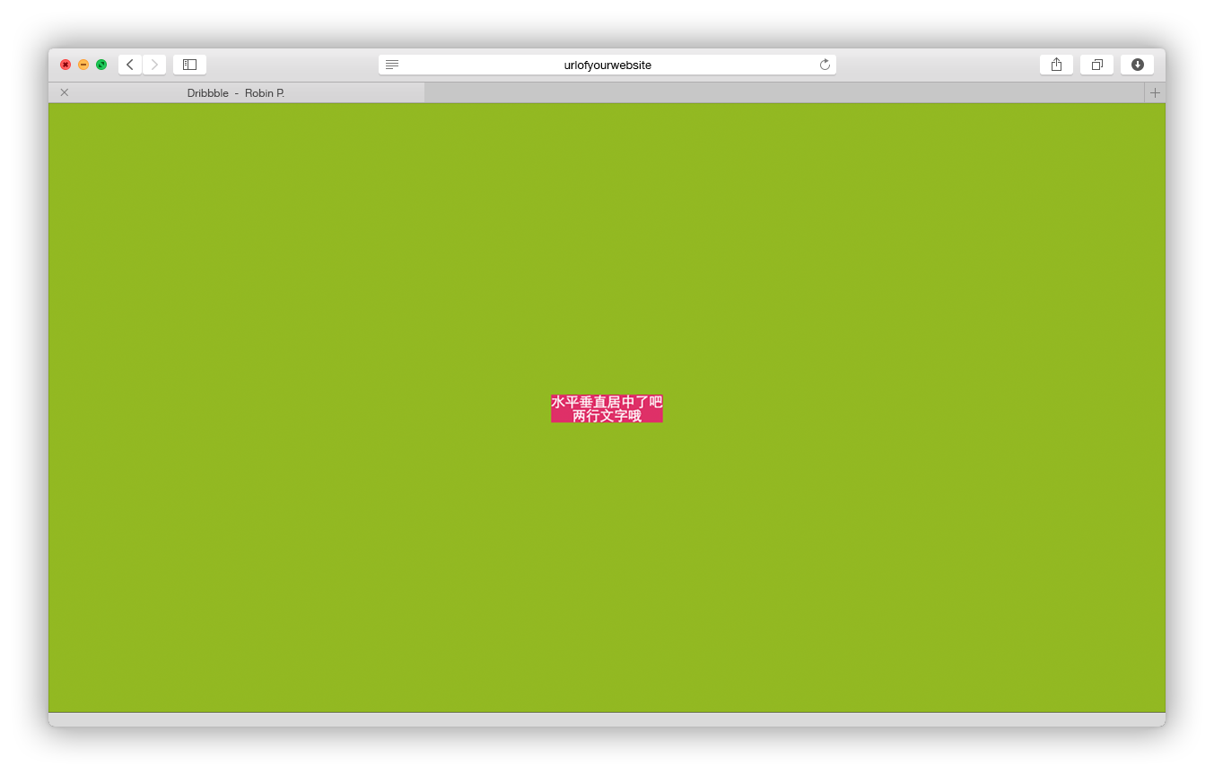
| <table>
<tr>
<td>
<div class="test">
水平垂直居中了吧<br>
两行文字哦
</div>
</td>
</tr>
</table>
|
结果预览
除了利用表单元素外,我们还可以将div元素通过display: table-cell;来让此元素会作为一个表格单元格显示;代码如下:
css部分
1
2
3
4
5
6
7
8
9
10
11
12
13
14
15
16
17
18
19
20
| <style>
*{
margin: 0px;
padding: 0px;
}
.wrap {
width: 600px;
height: 600px;
display: table-cell;
vertical-align: middle;
text-align: center;
background: #92b922;
}
.test {
background: #de3168;
display: inline-block;
color: #fff;
padding: 20px;
}
</style>
|
html部分
1
2
3
4
5
6
| <div class="wrap">
<div class="test">
水平垂直居中了吧<br>
两行文字哦
</div>
</div>
|
结果预览:
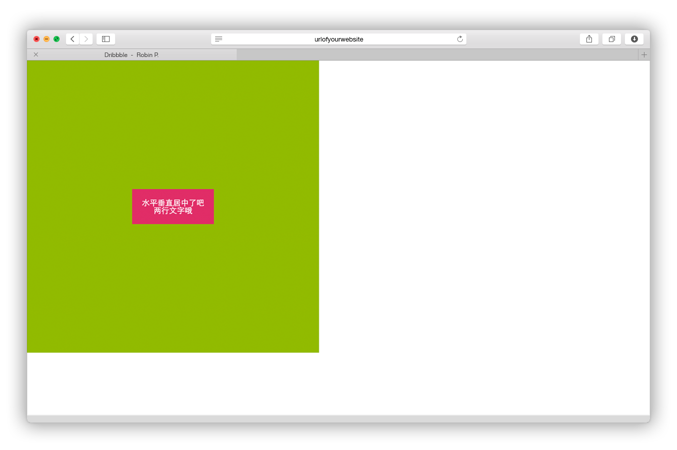
但需要注意的是:
- 盒子元素
.wrap不能有定位属性,除了relative外;不然将失去table-cell特性,无上下居中效果,只有左右居中效果;
二. 利用vertical-align:middle
这个是利用一个没有宽度b标签来实现水平垂直居中,代码如下:
css部分:
1
2
3
4
5
6
7
8
9
10
11
12
13
14
15
16
17
18
19
20
21
22
23
24
25
| <style>
*{
margin: 0px;
padding: 0px;
}
.wrap {
position: absolute;
width: 100%;
height: 100%;
text-align: center;
background: #92b922;
}
.test {
background: #de3168;
display: inline-block;
color: #fff;
padding: 20px;
}
.vamb {
display: inline-block;
width: 0px;
height: 100%;
vertical-align: middle;
}
</style>
|
html部分:
1
2
3
4
5
6
7
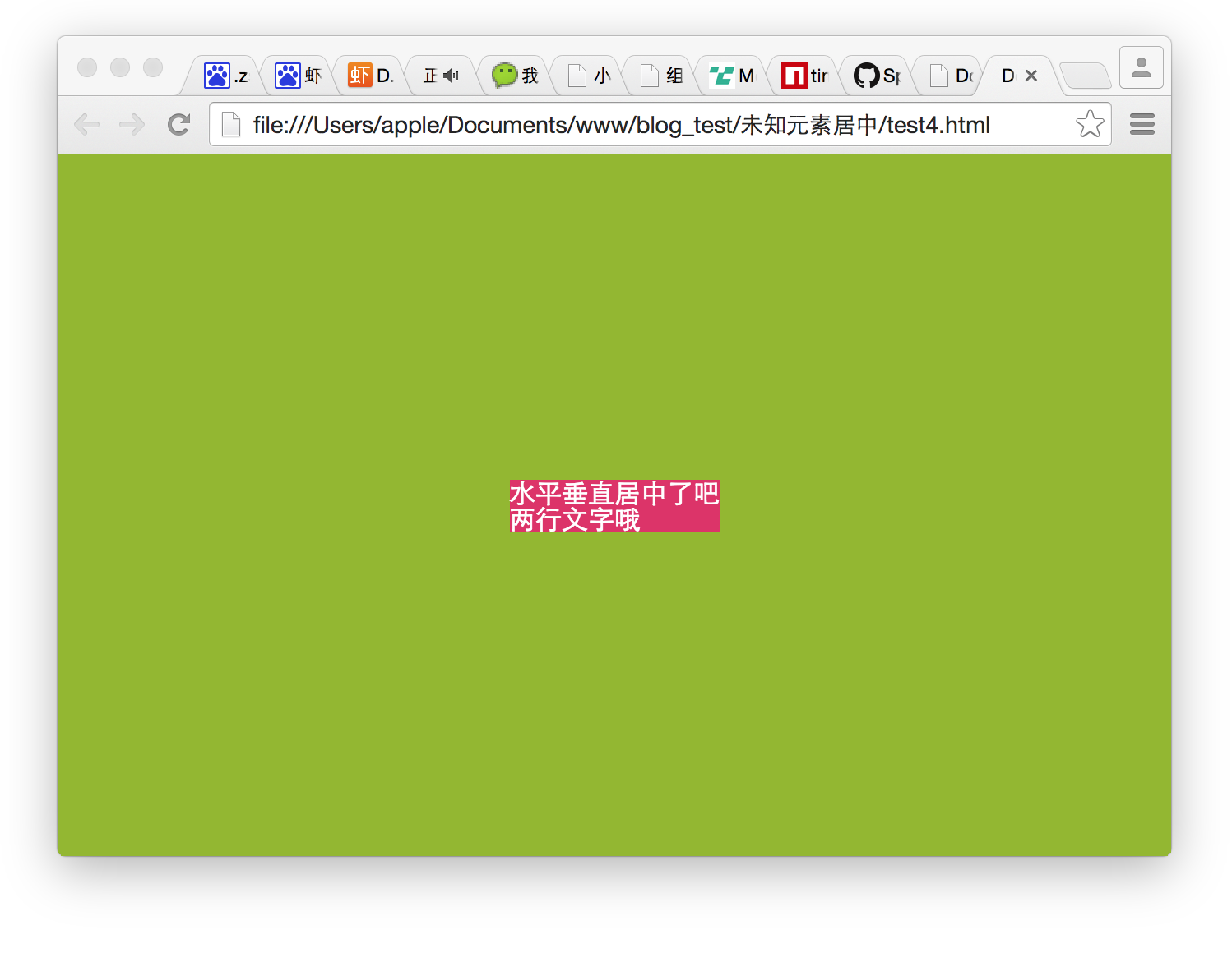
| <div class="wrap">
<b class="vamb"></b>
<div class="test">
水平垂直居中了吧<br>
两行文字哦
</div>
</div>
|
css部分:
1
2
3
4
5
6
7
8
9
10
11
12
13
14
15
16
17
18
| <style>
*{
margin:0px;
padding:0px;
}
body{
background: #92b922;
}
.test {
background: #de3168;
color: #fff;
position: absolute;
left:50%;
top:50%;
-webkit-transform:translate(-50%,-50%);
transform:translate(-50%,-50%);
}
</style>
|
html部分:
1
2
3
4
| <div class="test">
水平垂直居中了吧<br>
两行文字哦
</div>
|
结果预览:
四. 利用弹性盒模型
css部分:
1
2
3
4
5
6
7
8
9
10
11
12
13
14
15
16
17
18
19
20
21
22
23
24
25
26
27
28
29
30
31
32
33
34
35
36
| <style>
*{
margin: 0px;
padding: 0px;
}
.flex {
display:-webkit-box;
display:-ms-flex;
display:-webkit-flex;
display:flex;
}
.flex-hc {
-webkit-box-pack:center;
-ms-justify-content:center;
-webkit-justify-content:center;
justify-content:center;
}
.flex-vc {
-webkit-box-align:center;
-ms-align-items:center;
-webkit-align-items:center;
align-items:center;
}
.wrap {
position:absolute;
width:100%;
height:100%;
left:0px;
top:0px;
background: #92b922;
}
.test {
background: #de3168;
color: #fff;
}
</style>
|
html部分:
1
2
3
4
5
6
| <div class="wrap flex flex-hc flex-vc">
<div class="test">
	水平垂直居中了吧<br>
	两行文字哦
</div>
</div>
|
结果预览: